Logo
Everyone at El Camino College becomes responsible for building trust in the college. As stewards of the visual identity for El Camino, we build trust and brand equity as we use the graphic identity system consistently, repeatedly, and with confidence. The purpose of this logo guide is to help you do just that.
Logo Policy
This guide provides invaluable resources and essential guidelines to ensure all of our marketing and communications materials reflect the professionalism and commitment of El Camino.
Use this manual as a reference and a resource. Understand the reasoning behind the identity guidelines and ask for help or clarification as questions arise.
Request Logo PackAthletics Logo
For information about the EC Warriors Athletics logo, visit the Athletics Logo Guidelines.
Versions
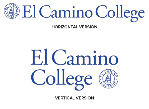
There are two versions of the El Camino logo. Both are equal in importance—one is not preferred over the other. It is comprised of a wordmark (text) and a symbol (circle bell icon).
The circle bell icon is an alternative logo option but is limited in use.
The logo below, labeled “Horizontal,” is one of two marks for the college. The full name is spelled out on one long line.
- Use it on all official materials when the horizontal orientation fits or looks best.
- This logo version should be used when its horizontal orientation works cohesively
with surrounding graphics
and information. - Its shape also fits in horizontal applications, such as a web banner ad or an imprint on pen.
- Use this logo in El Camino Blue, white or black only.

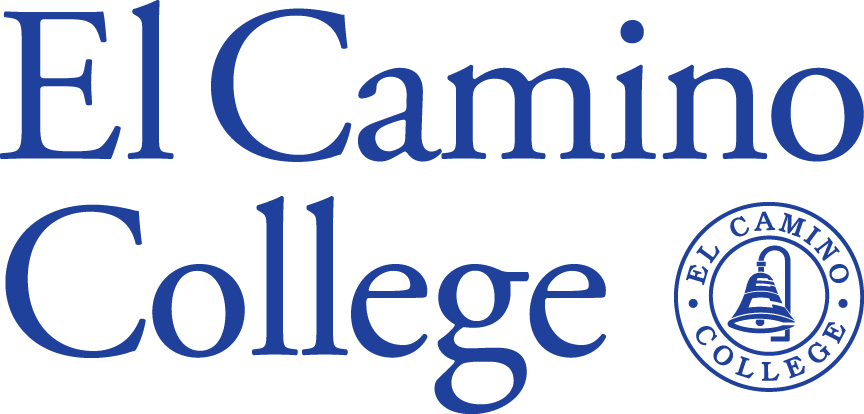
The logo labeled “Vertical” is the same as the horizontal version but has been reconfigured with the name stacked on two lines.
- It is left aligned and the bell icon is tucked into the lower right space to form an overall compact and centered rectangular shape.
- This option is designed for spaces such as web “skyscraper” digital ads, a lightpole banner, or admissions college fair pop-up banner.
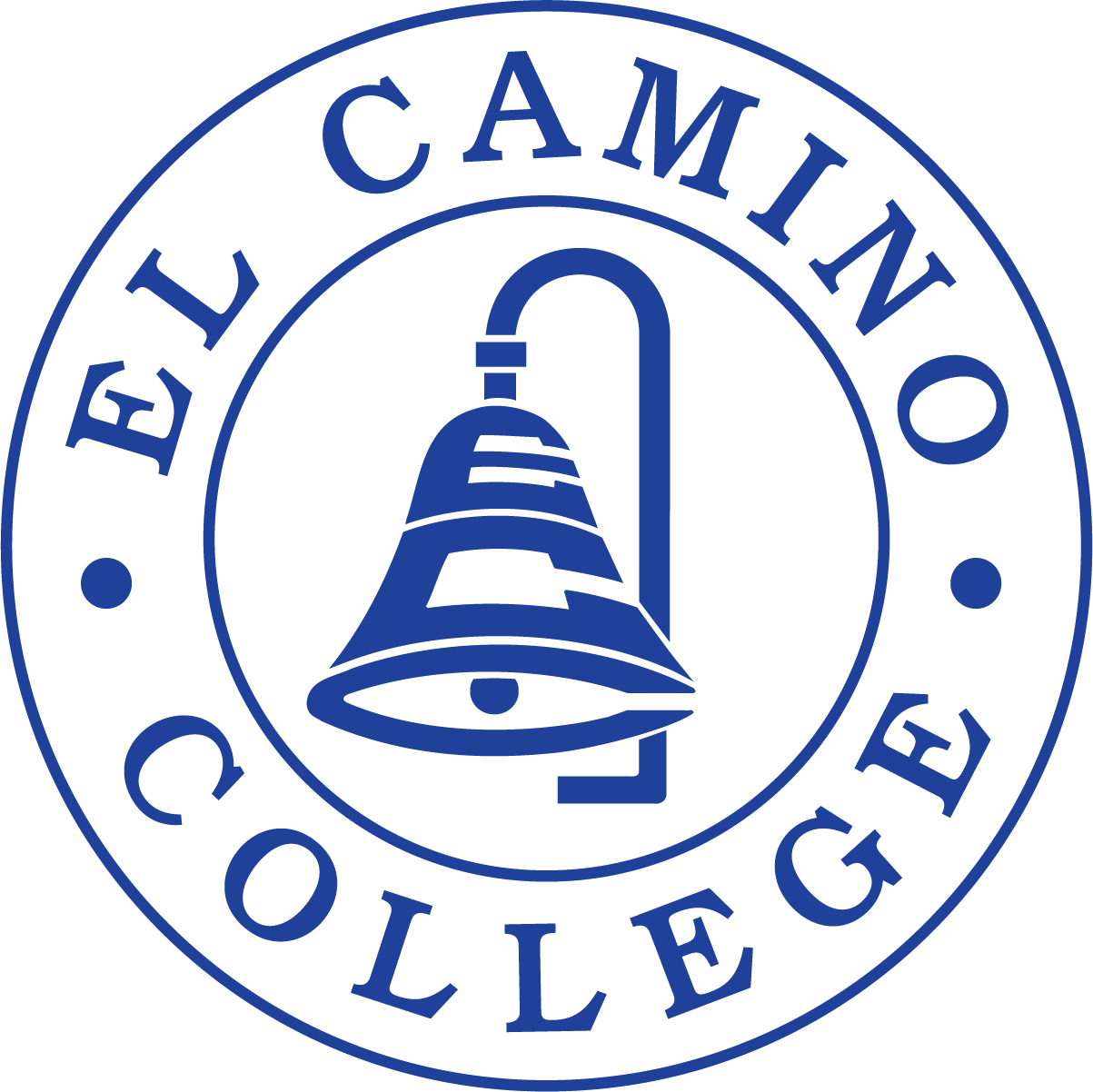
The circle bell logo is not the primary option to use.
Using the circle bell logo (without the wordmark) is limited to situations where it is the only reasonable solution.
Use it as a last resort only.
Usage
- Only the official hi-res versions of the logo should be used.
- These files are not intended to be edited in any way.
- Do not attempt to recreate the logo in any manner.
- The circle logo should not be used by itself (unless it is the only viable option).
How do you choose which version of the logo to use?
- Choose the logo which best fits the space while making the right statement.
- Bigger is not always better but optimal placement and fit can have a big impact.
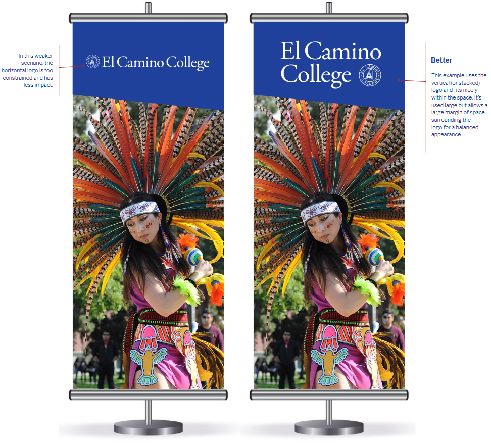
This illustration shows the same space on an application using the two logo options. The solution on the right uses the stacked version logo. Because the proportions of the logo relate to the space in which it’s placed, it fits better and can be used much larger. The result is a more impactful logo and balanced overall look.
The full logo (combined wordmark and bell circle) is the preferred version and is to be used whenever and wherever possible. Occasionally exceptions will need to be made.
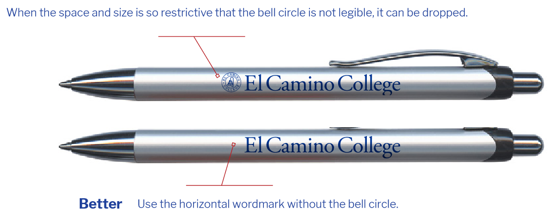
Below are examples where the El Camino identity is strongest when using partial elements of the full logo.
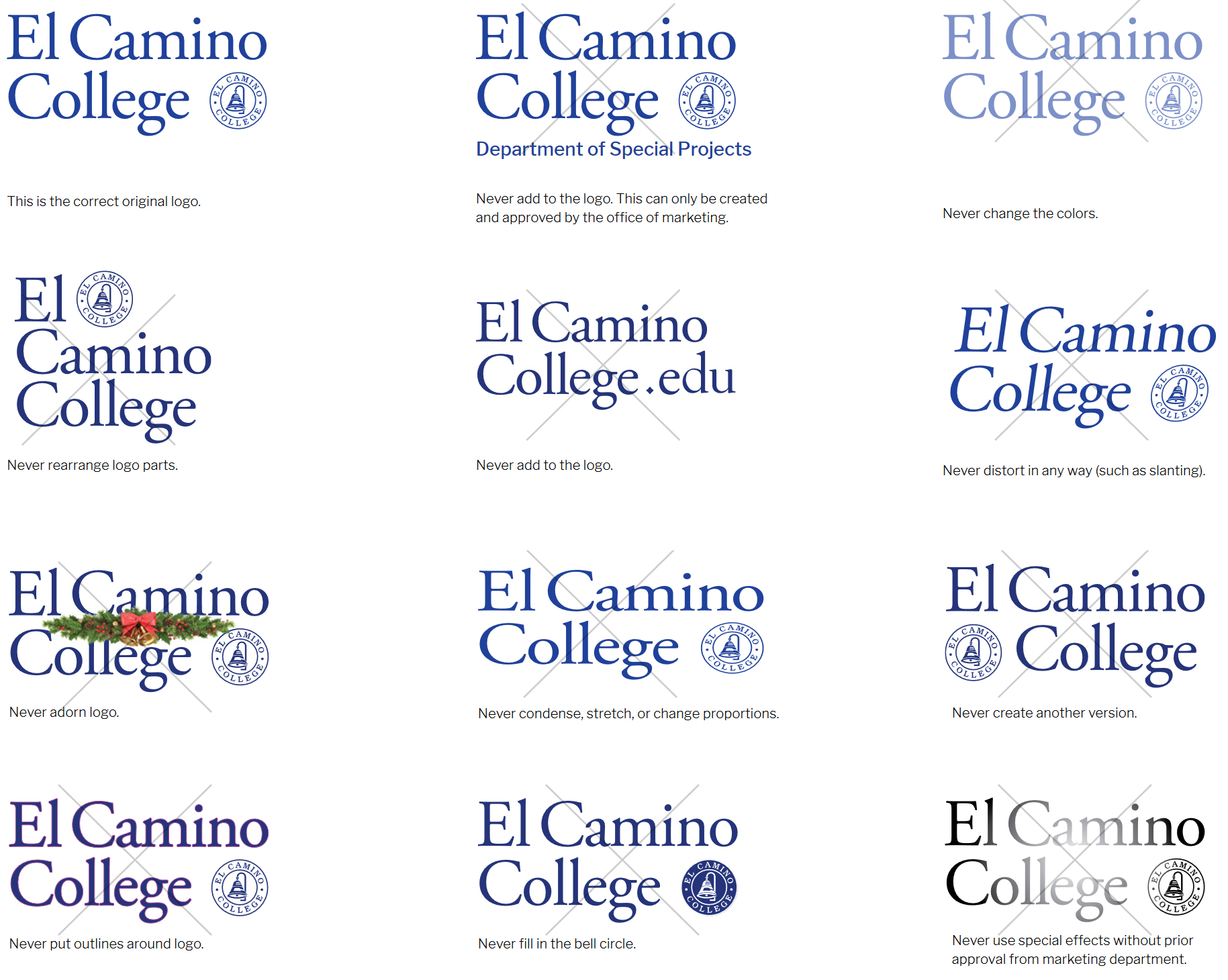
Do Not Do These Things to the Logo
When you are using our logo, maintain the proportion and integrity of the mark. This page contains some of the most common logo violations that tempt community members when using a logo.
We know people mean well, but tampering dilutes our brand. The hardest part of building equity in a logo is discipline. You may want to “get creative” with the look, but audiences expect familiarity, and consistency is paramount in a successful brand.
Subunit Logos
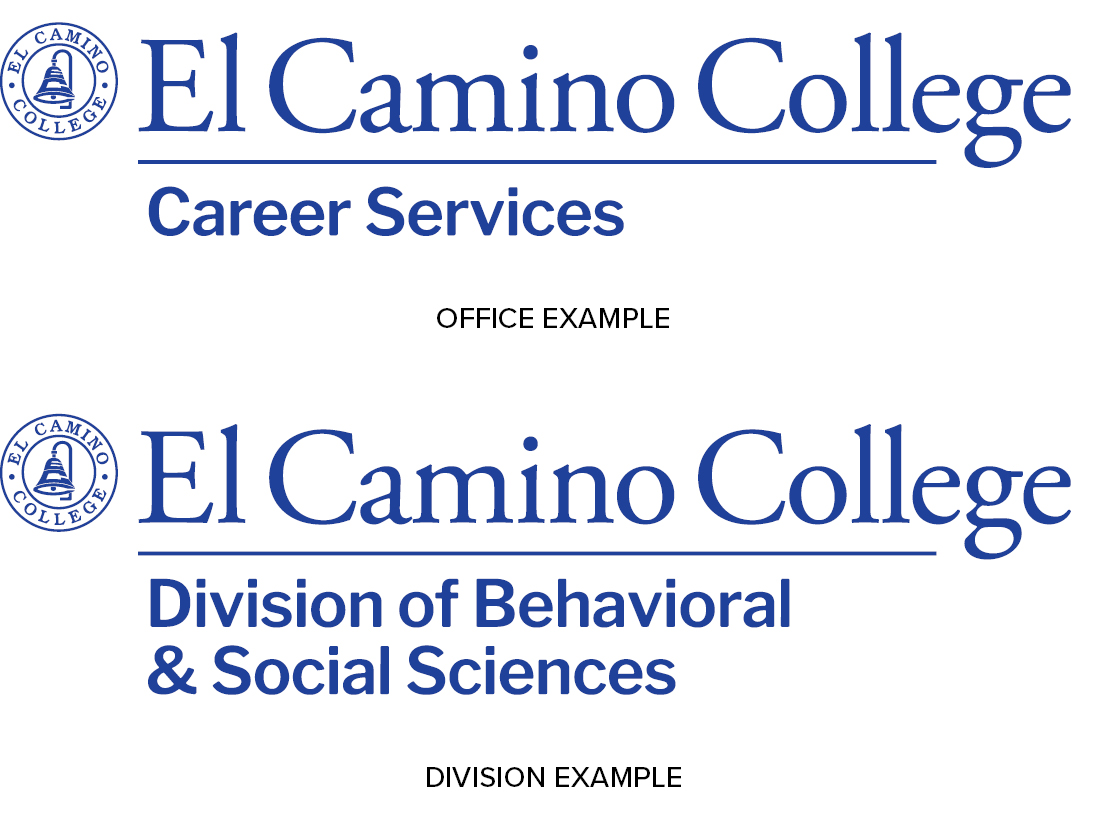
Logos for departments and offices combine the primary logo with the name of department. Always use the logo artwork created by Marketing & Communications.
Request a Subunit Logo
To request a subunit logo, contact [email protected].
Questions?
If you have questions, contact [email protected].
